Ella Rock
Girlish Publication Reel- sound on for full experience!
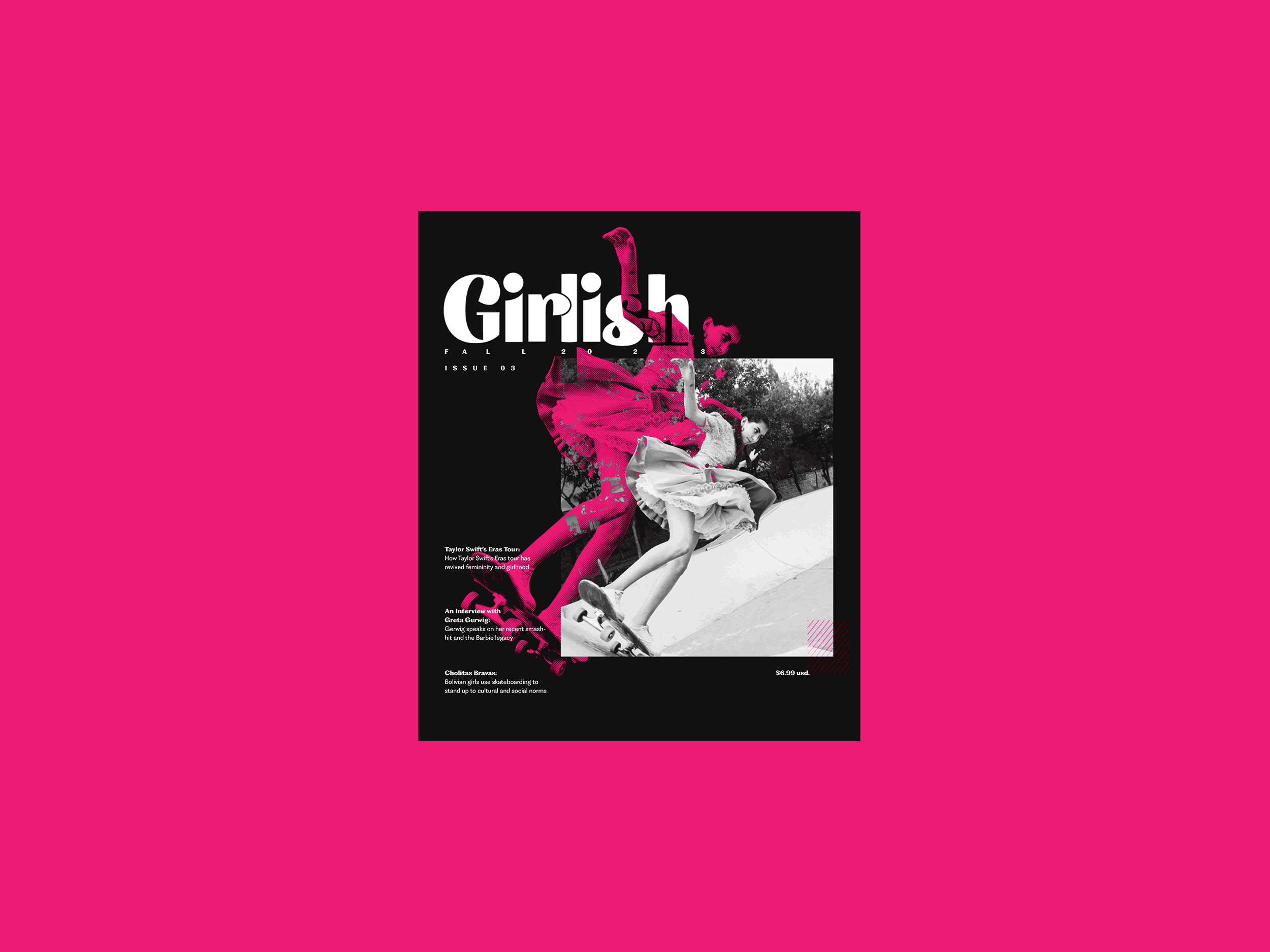
Girlish Publication
Publication design / Wordmark design / Typography
Fall 2023 + Summer 2024
Girlish is a cultural publication that reclaims femininity and celebrates everything it means to be a girl in today’s world. It prompts its readers to explore what femininity means to them through an exploration of cultural works and topics. It touches on
the serious and the not-so-serious, everything from legislation to up and coming
musical artists.
The experiences, ideas, and spirit of women and girls is a powerful force. A force that drives social change, cultural expression, and the economy. Girlish aims to harness this force into something even greater.
Wordmark Process
Throughout my typeface exploration, I prioritized using female-designed typefaces.
Throughout my typeface exploration, I prioritized using female-designed typefaces.
The Publication
Visual System
The nitty gritty details that gives Girlish its distinct look and feel.